Transom lettering, and what you can change
The Stitched Sailor crew · 2026-07-26 · 5 min read
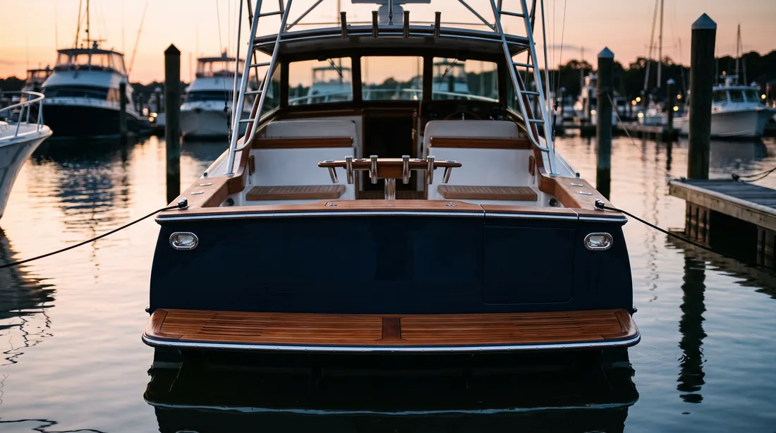
A hull shape tells you what class of boat it is. The lettering tells you it is yours. Get the name right and the hailing port wrong and the piece reads as almost-hers, which is worse than generic, because the mistake is specific and everyone aboard will find it.
That is why we do not read the lettering off your photograph and hope. You type it. In the studio the name and the hailing port are fields you set, and the artwork re-letters as you type, so you are looking at the actual result rather than a description of one.
Case is yours too. Some transoms are all capitals, some are title case, some run the port smaller underneath the name. Set it the way the transom actually reads, not the way a form would default it. If she is documented, the hailing port is a legal marking and worth matching exactly.
Ink colour is a separate decision from the drawing style, and you can see both before you commit. A drawing that sings in full colour on a white tee often wants a lighter ink on a navy one. Changing your mind costs nothing. Revisions are free and unlimited right up to approval, and approval is the only thing that sends anything to a press.
There is one genuine constraint and it is physical. Embroidery has a minimum readable stitch size. A long name with a hailing port under it, stitched on a cap front, can drop below the point where letters stay distinct. The honest answer is to change the placement, not to shrink it into a smudge, and where that comes up we will say so before it prints and suggest what will work.
If she has been renamed, or you want the old name on one piece and the new one on another, that is no trouble. The drawing is stored and the lettering sits on top of it, so a second version does not mean starting again.