Choosing the right photo
The Stitched Sailor crew · 2026-06-14 · 4 min read
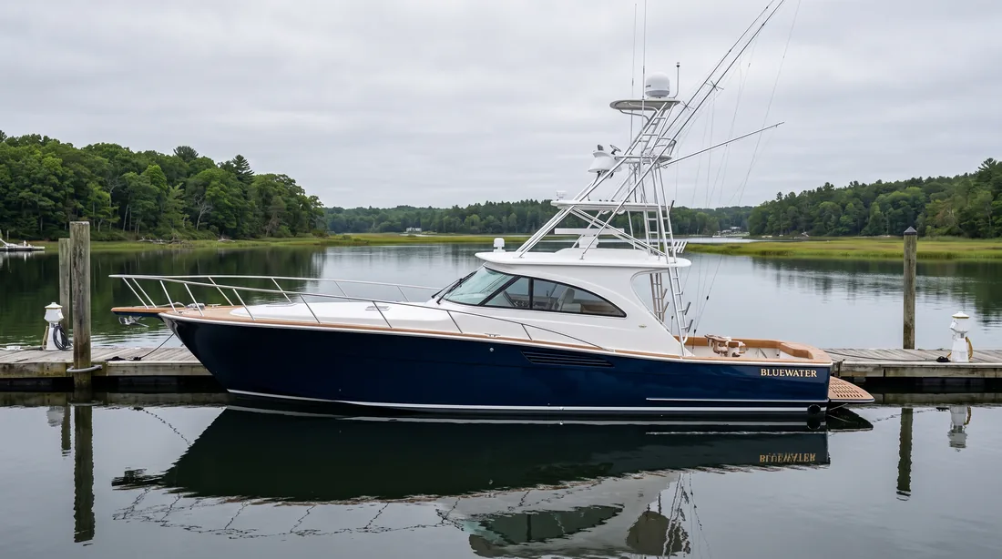
Most mates send a folder rather than a single photo, which is the right instinct. But the one you are attached to is rarely the one that draws best, because the memorable shot is usually memorable for a reason that has nothing to do with the hull: a fish on the deck, a sunset behind her, everyone up on the bow.
Sort for the boring one. The photo that draws best is generally the dullest to look at. Her, side on, flat light, nothing happening. All the information is there and nothing is competing with it. Keep the dramatic one for the wall and send us the plain one.
Rule out hard angles. A three-quarter view from off the bow looks powerful as a photograph and draws into a wedge, with a tiny stern and a hull that reads wrong. If the transom is barely visible, we cannot letter the name and hailing port from it either, and that is the part that makes the piece specifically hers rather than a boat like hers.
Look at the waterline. A boat floating level draws cleanly. Heeled hard, bow-high on a trailer, or hauled and sitting on stands, she has a different shape from the one people recognise. If she is out of the water, expect the drawing to show that, because pretending otherwise means inventing a waterline.
Check the file before you fall in love with a frame. A photo that looks fine on a phone can be small underneath, particularly if it came through a messaging app, which compresses hard. A screenshot of a photo is smaller again. Send the original from the camera roll rather than a forward of a forward. If the only copy you have is small, tell us, and we will decide together before it becomes a print.
When in doubt, send three and let us choose. We look at all of them and pick the one that holds up at print size, which is not always the one that looks best as a thumbnail.