Choosing an artwork style
The Stitched Sailor crew · 2026-08-19 · 4 min read
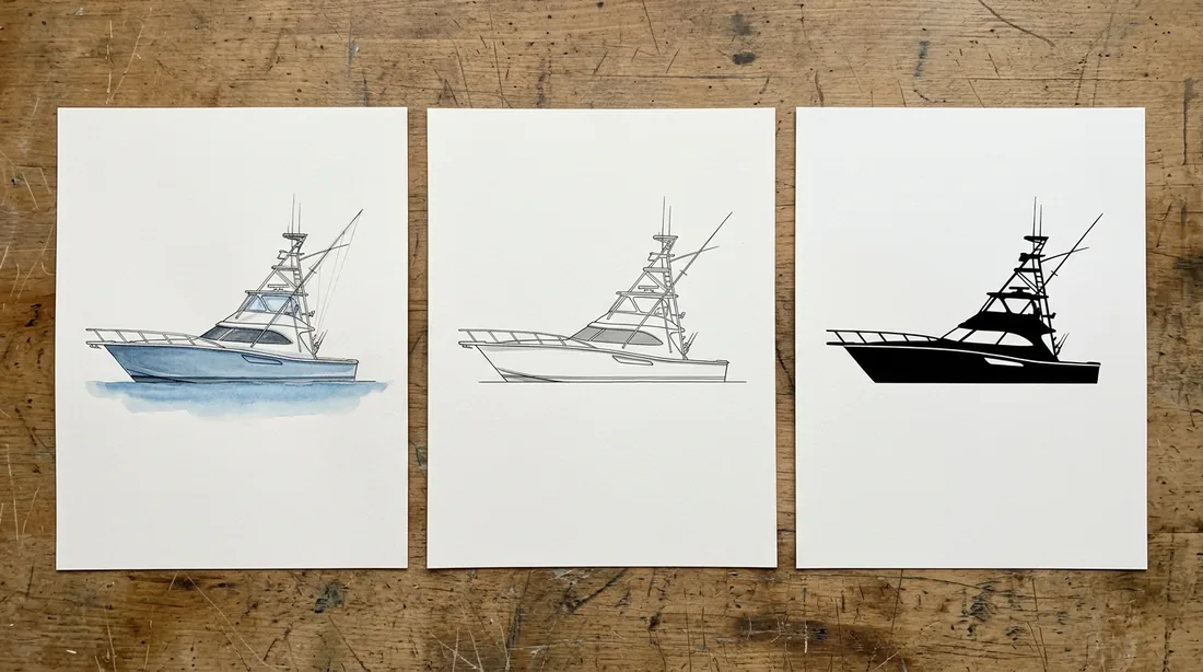
The studio hands back three versions of your boat from one photograph, and most mates pick on taste alone. Taste is a perfectly good reason, but the surface and the viewing distance are a better one, because the three styles fail in different ways when they end up in the wrong place.
Classic colour is the full drawing: hull colour, shading, the water under her. It carries the most information and is right for anything looked at closely and for a long time, which means canvas, framed prints, and a chest print on a light shirt. On something small it is the one most likely to lose detail, precisely because there is detail there to lose.
Silhouette reduces her to shape and line. It reads instantly from across a dock, survives being printed small, and works on surfaces where a full-colour drawing would go muddy. It is the safest choice for a cap front, a coozie, a sticker, or anything where the piece is small or the viewer is moving.
Knock out is the reversed one, for dark garments and dark field colours. Where classic colour would sink into a navy tee, a knock out puts the boat in light ink and keeps her legible. If you are buying dark shirts for a crew this is usually the one you want, and it is worth looking at before assuming the colour version will do.
You are not locked in. All three come from the same approved photograph, all three are stored, and choosing one for a tee does not stop you using another for the canvas. Plenty of boats end up with classic colour on the wall and a silhouette on the drinkware, which is the right way round.
If you cannot decide, look at them at the size they will actually print rather than full screen. A style that looks best large is not always the one that survives at two inches wide on a cap.